| 일 | 월 | 화 | 수 | 목 | 금 | 토 |
|---|---|---|---|---|---|---|
| 1 | 2 | 3 | 4 | 5 | ||
| 6 | 7 | 8 | 9 | 10 | 11 | 12 |
| 13 | 14 | 15 | 16 | 17 | 18 | 19 |
| 20 | 21 | 22 | 23 | 24 | 25 | 26 |
| 27 | 28 | 29 | 30 |
- 비관적락
- 힙
- PS
- JPQL
- SQL프로그래밍
- 스토어드 프로시저
- 데코레이터
- 다대일
- shared lock
- 스프링 폼
- eager
- execute
- fetch
- 다대다
- 연결리스트
- 즉시로딩
- 지연로딩
- exclusive lock
- dfs
- BOJ
- 이진탐색
- CHECK OPTION
- FetchType
- 동적sql
- 일대다
- 낙관적락
- 유니크제약조건
- querydsl
- 연관관계
- 백트래킹
- Today
- Total
흰 스타렉스에서 내가 내리지
[CSS] iframe 비율을 유지하면서 크기 조절하기 본문
<img> 태그는 width 속성을 설정해주면 이미지 비율에 따라서 height가 자동으로 설정된다.
그러나 <iframe> 태그는 그렇지 않다.
# 해법
<div class="area">
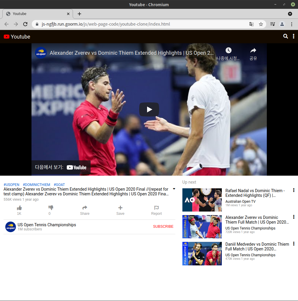
<iframe src="https://www.youtube.com/watch?v=2WjkzGb4u84" />
</div>iframe을 div로 감싸서 div의 크기에 iframe의 크기를 맞추면 된다.
iframe의 width와 height를 100%로 하고,
div의 padding-bottom에 % 을 줘서 div의 가로세로 비율을 조절한다.
유튜브 영상의 비율인 16:9로 하려면 padding-bottom에 56.25%를 넣는다.
.area {
  position: relative; /* absolute는 부모가 relative일 때 부모를 따라간다. */
  width: 100%;
  padding-bottom: 56.25%; /* 16:9 비율 */
}

.area iframe{
  position: absolute;
  width: 100%;  /* 부모에 맞게 꽉 채운다. */
  height: 100%;
}
그런데, 반응형 웹사이트를 만드는 과정에서, 특정 사이즈 이상으로는 동영상 크기가 더 이상 커지지 않는 걸 구현하는데,
부모 아이템을 padding-bottom으로 설정하다보니 max-width는 말을 들어도 max-height는 말을 듣지 않았다.
너비는 지정한 너비에서 멈춰 있는데, 브라우저 사이즈를 키울 수록 높이만 늘어나 비율이 이상해지는 현상이 발생.
iframe의 부모요소의 padding-bottom이 브라우저 사이즈를 따라가 계속 커지는게 문제이므로, padding-bottom의 한계값을 만들어주는게 필요했고, iframe의 부모의 부모박스를 만들어 거기에 max-height를 주면 된다고 생각했다.
결론은 성공. 코드는 아래에 있다.
# 안 되는 코드
  <!-- Video Player -->
  <section class="player">
   <iframe src="https://www.youtube.com/embed/2WjkzGb4u84" title="YouTube video player" frameborder="0" allow="accelerometer; autoplay; clipboard-write; encrypted-media; gyroscope; picture-in-picture" allowfullscreen></iframe>
  </section>
/* Video Player */
.player{
position: relative;
width: 100%;
padding-bottom: 56.25%; /* 16:9 비율 */
max-width: 800px; /* 특정 사이즈 이상으로는 비디오가 더 이상 커지지 않게. 즉 반응형으로 만들 수 있음.*/
max-height: 450px;
}
.player iframe{
position: absolute;
width: 100%;
height: 100%;
text-align: center;
}
# 해결 코드
  <!-- Video Player -->
  <section class="player">
    <div>
      <iframe src="https://www.youtube.com/embed/2WjkzGb4u84" title="YouTube video player" frameborder="0" allow="accelerometer; autoplay; clipboard-write; encrypted-media; gyroscope; picture-in-picture" allowfullscreen></iframe>
    </div>
  </section>
/* Video Player */
.player{
max-width: 800px; /* 특정 사이즈 이상으로는 비디오가 더 이상 커지지 않게. 즉 반응형으로 만들 수 있음.*/
max-height: 450px;
}
.player div{
position: relative;
width: 100%;
padding-bottom: 56.25%; /* 16:9 비율 */
}
.player iframe{
position: absolute;
width: 100%;
height: 100%;
text-align: center;
}
위에서 지정한 사이즈 (800px)가 넘으면 동영상이 브라우저 가운데에 정렬했으면 했는데, 그게 또 안된다.
iframe을 div로 2번 묶어줬고,
section에게 max-height를 부여, 배경색을 검정색으로 하였다.
가운데 정렬의 핵심 코드는 .player div{}에 있는 left속성과 transform 속성이다.
  <!-- Video Player -->
  <section class="player">
    <div>
      <div>
        <iframe src="https://www.youtube.com/embed/2WjkzGb4u84" title="YouTube video player" frameborder="0" allow="accelerometer; autoplay; clipboard-write; encrypted-media; gyroscope; picture-in-picture" allowfullscreen></iframe>
      </div>
    </div>
  </section>
/* Video Player */
.player{
width: 100%;
max-height: 450px;
background-color: black;
}
.player div{
position: relative;
max-width: 800px; /* 특정 사이즈 이상으로는 비디오가 더 이상 커지지 않게. 즉 반응형으로 만들 수 있음.*/
left: 50%; /* 동영상을 브라우저 가운데에 정렬하는 코드 (2줄, left, transform)*/
transform: translateX(-50%);
}
.player div div{
position: relative;
width: 100%;
padding-bottom: 56.25%; /* 16:9 비율 */
}
.player iframe{
position: absolute;
width: 100%;
height: 100%;
text-align: center;
}
'HTML&CSS' 카테고리의 다른 글
| [CSS] em과 rem (0) | 2022.01.25 |
|---|---|
| [CSS] 버튼의 크기 키우기 (0) | 2022.01.23 |
| [CSS] 기본 css 코드 (0) | 2022.01.16 |
| [HTML] Emmet 단축어 (0) | 2022.01.14 |
| [CSS] CSS의 flexbox (0) | 2022.01.14 |